Does the focus on one iconic global temperature plot make sense?

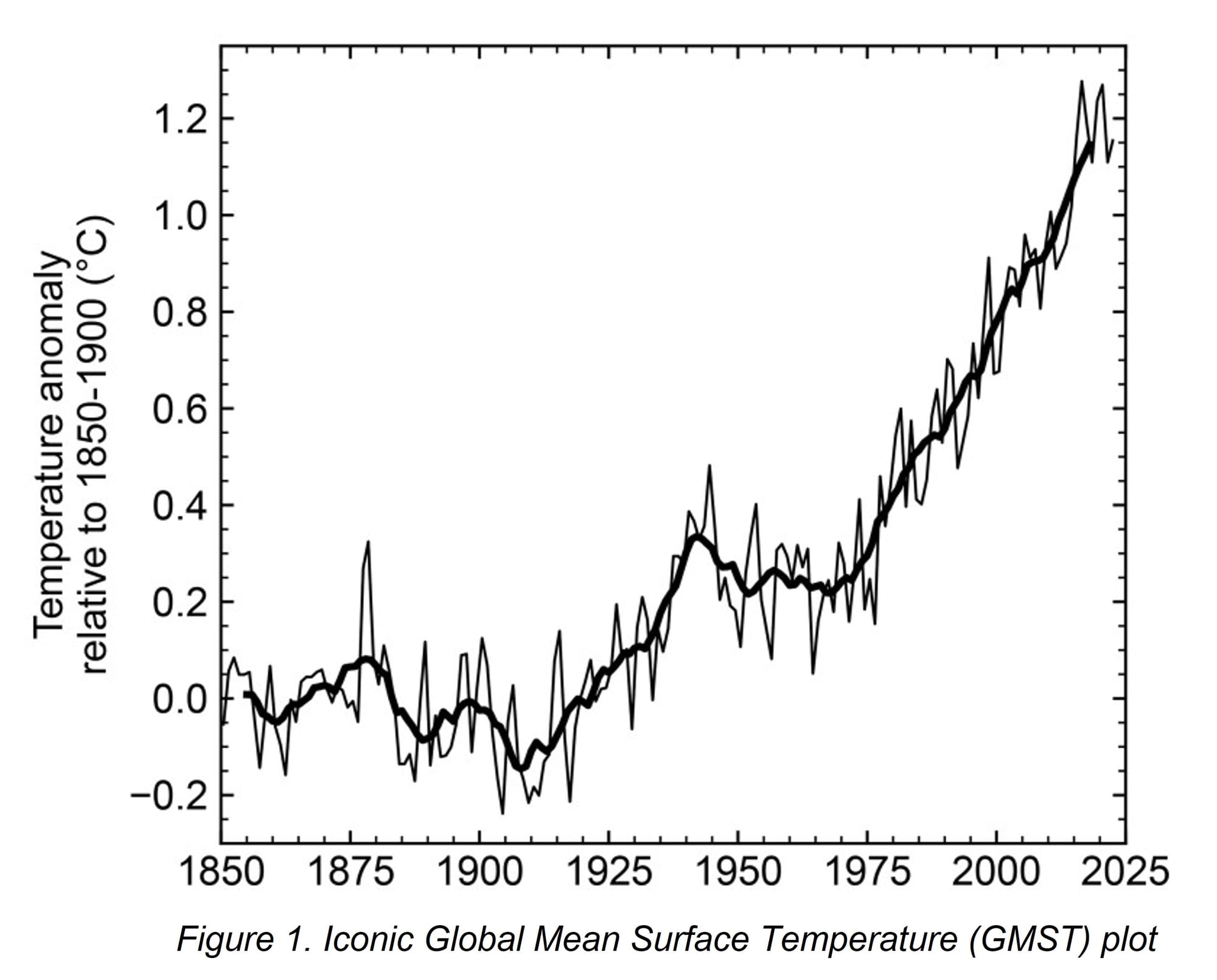
The iconic plot of Global Mean Surface Temperature (GMST), such as figure 1 above ,which is taken from the article Indicators of Global Climate Change 2022, form the focus and principle argument for action to combat Climate Change. This plot is an average over the whole global while in reality the temperature evolution is very different from region to region around the world.
In this iconic plot, a level of temperature rise of 1.5°C relative to a "pre-industrial" period, is frequently quoted to suggesting the point where serious, irreversible, damage will occur for the environment. The website, Indicators of Global Climate Change for Policy Makers, explores in detail when the temperature values will exceed the 1.5°C limit. Figure 2 shows a plot from this website.

Figure 2. Plot from IGCC with decadal average GMST data curve (light grey) compared to their predicted human-induced global warming (orange). The annotations, "Natural?", for the dip in the data around 1910 and the bump around 1940 have been added to the original image.
The current page studies the uncertainties on temperature measurements and the variations of GMST data around the world in order to see if the focus on a single plot makes any scientific sense. The 1940s bump in figure 2 is very prominent in the data of some regions but not others. A secondary question is if the fuss about a precise 1.5°C level has any significant meaning.
Differences between land, sea, north, south
Figure 3 shows the world divided between northern and southern hemispheres and between land and sea. For the northern hemisphere it can be seen that the temperature increase from the 1850-1900 reference period to 2022 is 1.9°C over land while it is only 1.0°C over the sea. For the southern hemisphere the increase is 1.3°C over land and 0.9°C over sea.

Figure 3. Plot of evolution of temperature for Northern and Southern Hemispheres showing temperature anomaly separately over land regions and sea regions of the world. (HadCRUT5 data, 1850-1900 reference period).
Temperature measurements have uncertainties
Any measurement of a physical quantity has an experimental error and the proper treatment of these errors should be an essential part of any analysis of experimental data. The data in the iconic GMST plot comes from numerous individual measurements around the world. A major input into the global mean temperatures comes from land based weather stations, the number of which varies with year in the range 10000-20000 stations. In early years, the instruments used were thermometers each of which could be read with an experimental accuracy of 1-2°C. In a full year this make 4-7 million recordings. If these recordings were uncorrelated and unbiased the uncertainty on the combined annual average would be less than 0.001°C. In fact the measurements are not uncorrelated and unbiased and so the real uncertainty is much bigger than this tiny value. The groups providing the data used for the GMST sometimes provide data uncertainties and sometimes do not. The HadCRUT group provides uncertainties which can be converted to one standard deviation error bars. These are plotted on the GMST data below and are in the range 0.05-0.09°C for the years 1850-1950 and in the range 0.01-0.02°C for the years 1970-2022.
The GMST plots are presented as "Temperature Anomalies" where the data is compared relative to a reference period. Sometimes the reference period is 1850-1900 but sometimes other periods are used for various reasons. Figure 4 displays the GMST data with error bars and with different reference periods showing the change. The conclusion must be that quoting any temperature rise relative to pre-industrial time with a precision less than 0.05°C is meaningless.

Figure 4. GMST data plot with error bars from HadCRUT. The data is displayed with two different reference periods 1850-1880 and 1850-1880.
Temperature evolution is not monotonic
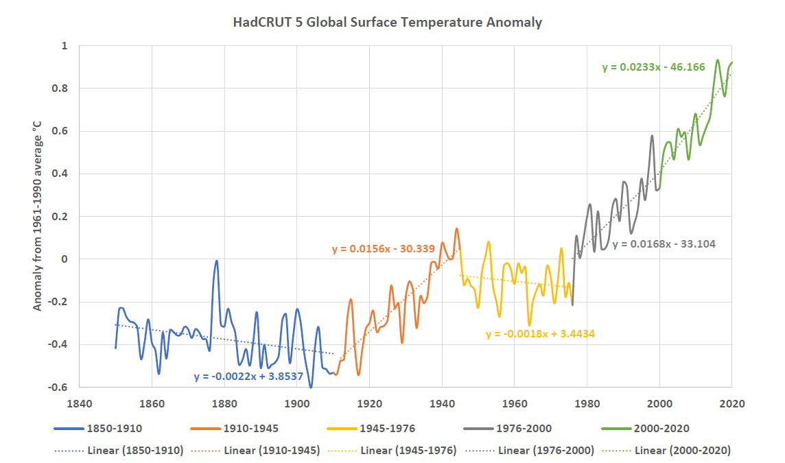
The iconic temperature evolution plot clearly does not show a monotonic increase in temperature as would be expected if the change in temperature was only controlled by a monotonic rise in atmospheric CO2 levels. Figure 5 shows fits to different time periods indicating falling temperatures in the periods 1850-1910, 1945-1976 and increasing temperatures in the periods 1910-1945, 1976-2022.

Figure 5. Fits to iconic Global Mean Surface Temperature described in Clintel's IPCC Report 2023.
Temperature rise are largest in the Arctic
The slopes of the temperature changes in different time periods differ greatly around the globe. For the plots in the rest of this page the data is mainly taken the ERA5 global analysis reanalysis which covers both land and sea regions. Linear fits to this data are made allowing different slopes for two time periods 1945-1976 and 1977-2022. The example plots in figure 6 show linear fits for three latitude ranges. These plots indicate different trends: for the high latitudes, 3°C temperature rise 1977-2022 but lower slope for 1945-1976; for mid-latitudes, 2°C rise for 1977-2022 but 0.5°C fall for 1945-1976 and for low-latitudes, 0.6°C rise for 1977-2022 and lower slope for 1945-1977.

Figure 6. Example temperature evolution plots for three latitude ranges: high-latitudes 75-90°N; mid-latitudes 30-45°N and low-latitudes 0-15°N.
Figure 7 summarizes the temperature trends as a function of latitude for the two time periods. In the southern hemisphere the slope are much smaller than in the northern hemisphere with negative slopes in the some regions.

Figure 7. Temperature evolution slopes vs. latitude averaged over all longitudes. Plotted for two time periods 1945-1976 and 1977-2022.
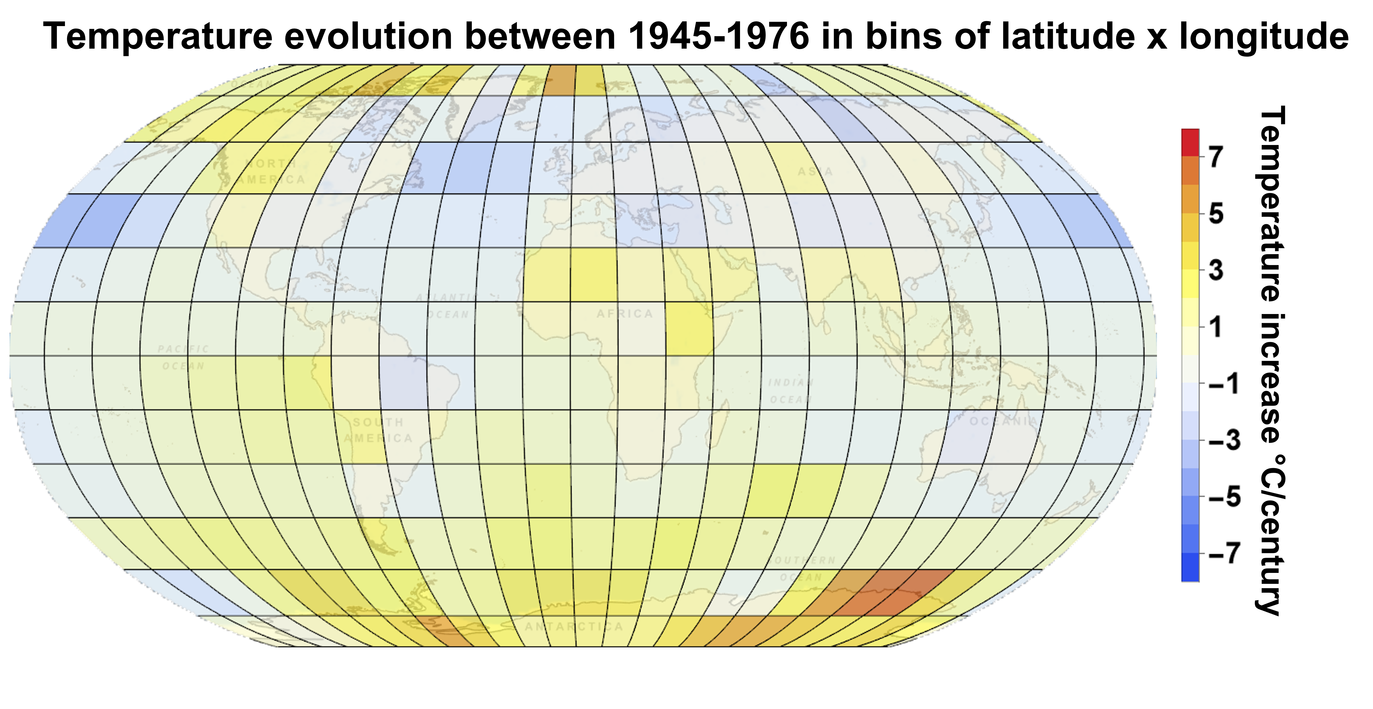
Figures 8 and 9 show the slopes of the temperature trend data in 15° X 15° bins of latitude x longitude. The first plot show the temperature slopes for 1977-2022 and the second for 1945-1976. Again the very significant difference in warming between the two time periods is seen with the warming being largest in the longitude regions north of Siberia.

Figure 8. Temperature trends for bins of 15°x15° of latitude and longitude, for 1976-2022. Red regions have temperature increases >7°C/century and white increases <1°C/century.

Figure 9. Temperature trends for bins of 15°x15° of latitude and longitude, for 1945-1976. Orange regions have temperature increases >5°C/century and blue regions have decreases >3°C/century.
The high warming in the Siberian arctic region in 1977-2022 is well known and described in the paper: Rantanen et al., The Arctic has warmed nearly four times faster than the globe since 1979. Figure 10 shows the high warming region analysed in this paper.

Figure 10. Annual mean temperature trends for the period 1979–2021, derived from the average of the observational datasets from the paper Rantanan et al.
The page on the current website: Plots for Arctic Land Regions, show temperature evolution plots for various arctic land regions from 1900-2022 taken from Berkeley Earth. These particular plots, together with figure 5, show that the drops in temperature in the period 1945-1976 in some regions of figure 9 are preceded by increases in the period 1910-1945, so the driving feature is the bump around 1940 seen in figure 2. In the Arctic Land Region plots the 1940 bump appears with very different amplitudes in difference places. The origin of this bump which is surely "natural" and not caused by a monotonic increase of CO2 levels needs to be explained.
Temperature rise in the Arctic is mainly in the winter
Seasonal variations are another big factor in temperature trends. Figure 11 shows examples of summer/winter variations at Arctic and Antarctic latitudes. For the Arctic most of the warming takes place in the northern winter and for the Antarctic the largest warming is also in the southern winter, but the warming is much smaller than the Arctic. Figure 12 illustrates the summer/winter variations as a function of latitude.

Figure 11. Examples of seasonal variations of temperature evolution for latitude ranges: Arctic 75-90°N and Antarctic 0-15°N, both integrated over all longitudes. Blue curve is Jan, Feb, Nov, Dec (NH winter) and red curve are May, Jun, Jul, Aug (SH winter).

Figure 12. Seasonal variations of temperature evolution slopes vs. latitude averaged over all longitudes. The two curves are for the month ranges indicated and for the time periods 1977-2022.

Figure 13. Histograms of temperature trend slopes in bins of 15° X 15° in latitude x longitude as in figures 8, 9. Left-hand plots are for fits to the period 1977-2022 and right-hand to the period 1946-1976. The top plots are fits to the full year and the bottom plots are to the summer (May, Jun, Jul, Aug for NH, Nov, Dec, Jan, Feb for SH) and for the winter (reverse month attribution).
Figure 13 illustrates the vast range of temperature trends around the globe by making histograms of the slopes displayed in figures 8 and figure 9. The histograms are for the two periods and for the full year, summer and winter as indicated. Again it can be seen that the temperature increases are much larger for the 1977-2022 period than the 1945-1976 period and that the slopes for some latitude, longitude bins in winter have temperature increases up to 20°C/century. Some regions for the period 1955-1976 have temperature decreases up to 5°C/century.

Figure 14. Temperature trends in Northern Hemisphere and Southern Hemisphere temperate zones and the Arctic and the Antarctic.
Figure 14 emphasises the major differences in warming trends for the Northern and Southern Hemispheres where for the temperate zones, where the north warms 2.5 faster than the south during the periods 1976-2022 and the Arctic which warms 4.6 times faster than the Antarctic in the same period.
Conclusions
The data clearly shows that on average the surface temperature around the world is increasing. This increase is very clear in the period 1977-2022 but less clear for earlier periods with some periods where the temperature actually decreased. The regions where the temperature increases are large in the Arctic show a very much bigger rise in winter compared to summer.
The iconic plot of global mean surface temperature hides a multitude of temperature variations which are much larger than the anomalies in this particular plot. It is unconvincing that comparisons, such as figure 2, showing "human-induced warming" with the temperature trend data prove that the causes of the temperature changes are completely understood. Many questions must be answered:
- Why does the Northern Hemisphere warm so much more than the Southern Hemisphere?
- What causes the dip in the data around 1910 and the bump around 1940?
- What is special about the Siberian Arctic?
- To what extent do climate models explain the regional effects in general.
Finally, the emphasis on the limit of "1.5°C rise pre-industrial" is obviously used as a propaganda stunt and has nothing to do with scientific interest. As well as the large regional variations, the value depends completely on the definition of the pre-industrial reference period during a time where the temperature uncertainties are large and have significant temperature variations with year.